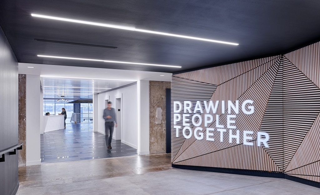
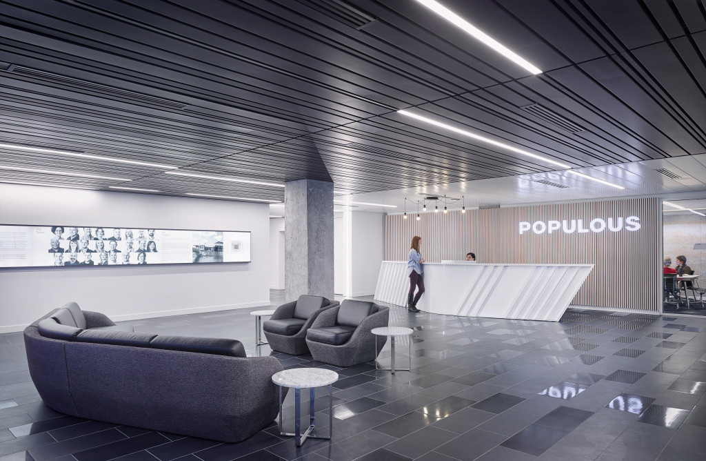
Kansas City sports architecture firm Populous is showcasing its personality its new home at 4800 Main Street. Housed in the former Board of Trade building, the brightly colored space represents the firm’s brand, people, and the direction in which it’s moving and growing.
We sat down with Todd Spangler and Andrew Elmer, the two lead designers on the project, to discuss what it was like to bring the Populous brand to life.
Creating an environment
The design process started as most do; with a handful of charettes involving any and every associate at Populous, from landscape architects and planners to interior designers and support staff. Because each department works in a different way, it was critical to gather input from the start, and hear what each team needed to work most efficiently.
“Each had their own requirements and needs so it was really about listening to everyone, which is most of what we do as architects: Listen, take what our clients need, and turn it into what kind of space they inhabit,” Spangler said. “It was quite a task; to please and give them what they need while also creating an environment that fosters creation and collaboration, which is important for us.”
Elmer says based off that input, the design team took the strongest ideas and applied them as design principles throughout the space. Over the course of half a dozen charrettes, the conversation revolved around how people work and collaborate.
“Probably the most difficult task as an architect is to design for your fellow architects, because we tend to be somewhat critical,” Elmer said.
Blurred lines
Elmer and Spangler said the first goal of the project was to create a space where the lines between the interior and the exterior were blurred. It started with a complete re-skinning of the building; Today the glass façade lets light pour in, highlighting the grandstand in the heart of the building.
The focal point
The biggest component of the design is the grandstand, a large wooden staircase in the heart of the building where the members of the firm gather and host presentations and special events. It’s located in a significant part of the building: the original trading floor.
“Knowing that this was the trading floor, we wanted to make something special out of that,” Spangler said. “It’s the first thing you see, so everything is designed around it. We wanted to create an exciting moment and connection to the street. When the shades are up and the lights are on when you’re walking by at night, it’s pretty exciting.”
Fostering collaboration
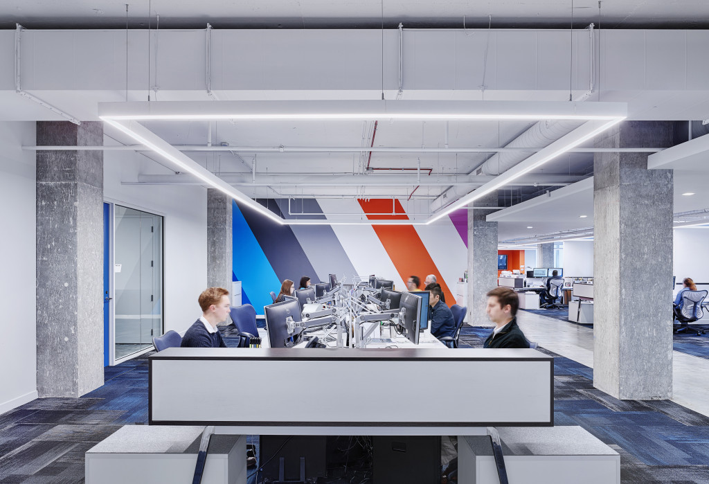
In an effort to reduce the number of meeting rooms within the office, the design team took the technology from conference rooms and brought them into the work bays. Now, between sets of desks, a center island holds a monitor with a quick plug-and-go display, as well as storage for drawing sets and materials. This allows the team to have quick meetings and discussions and go back to work quickly and efficiently, rather than worrying about booking a meeting room and going to the other side of the building to gather around tech. Due to these shifts, the company was able to reduce its meeting rooms from 20 to 8.
Celebrating the process
Perhaps one of Elmer’s favorite aspects of the new office design is that it aims to showcase the architectural design process – not just the finished piece.
“At our former office, everything was about the end result, the product, so all of our work was framed and either sat in a glass box or hung on the wall,” Elmer said. “Here, we wanted to celebrate the actual design process itself, which is not something that a lot of people witness but is probably the piece as architects that we’re most proud of: how the design develops, how our babies grow.”
Magnetic white boards are scattered throughout the office, allowing witnesses to the process and enabling associates to work through design issues with co-workers.
“It’s all out there because it reflects our culture,” he said. “We’re a growing culture of senior staff and emerging, developing younger staff, so we have an interesting dynamic between that part of the practice, and we wanted that to manifest itself physically in the office.”
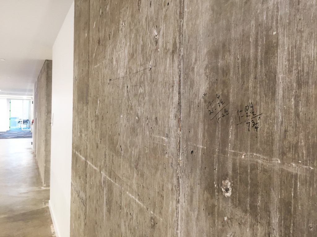
Another way the team aimed to celebrate the process was to leave parts of the original structure exposed. In order to do that, the team tried to build as few walls as possible, keeping concrete columns as they were – complete with sharpie scribble measurements and all.
In other ways, the team kept alive this theme of transparency.
“Another interesting challenge was engaging our staff. As a design team of about 10, we had another 260 employees that didn’t get to be here everyday. Todd and I would stop by on our way to the office and on our way back home again because we were so passionate about the project, and we got to see it everyday — but not everyone else did,” Elmer said. “So how did we keep them engaged? We had a number of activities that helped us transition from the River Market to our Main Street office. Some of those included bringing staff down to review the space mid-construction, we had a few other activities like that where folks could come here and see the process and really start to get excited about it.”
Room to grow
Now that a non-compete with HOK has expired, Populous is beginning to expand its reach outside of the sports architecture realm. Today, it’s focusing on growing its aviation work and is looking to do more brand activation, campus planning, and potentially hospitality. The new office, Elmer and Spangler said, will enable the firm to grow by allowing it to attract and retain top talent.
“I think it keeps us all excited and keeps us wanting to come here and do great work. We’re doing great work right now; expanding on what we do, how we do it,” Spangler said. “We’re becoming something really interesting and this space allows us to think creatively and expand our horizons.”
For Elmer, the project showcases the firm’s abilities.
“We really enjoyed this project, and the challenges and opportunities in business and design that came with that,” Elmer said. “This building is a physical manifestation of our brand, and it represents us and where we’re going.”
The project team included JE Dunn, general contractor.


